It’s one of an E-Commerce site’s worst nightmares. Cart abandonment leaves money on the table, literally. Cart abandonment occurs when shoppers add items to their cart but leave the app or website without purchasing. While you can chalk it off as them being window shoppers or believe they’ll be back, there’s a better way to address checkout page cart abandonment.
This article focuses on applying emerging user research to design interactions, particularly checkout heatmap studies, and how Krepling Pay uses this data.
You’ll find a lot of data and opinions if you search the web to optimize checkout UX strategies. Unfortunately, a large portion of this information is based on guesswork and a few rounds of AB testing instead of being based on actual behavior.
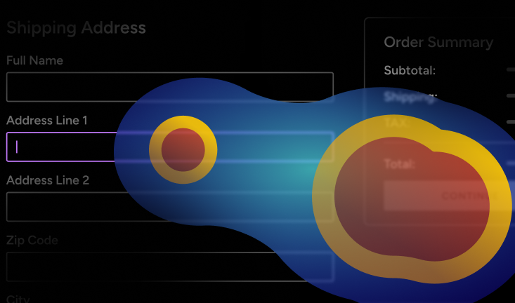
Heatmaps and e-commerce session tracking can track where users pause, drop off, or get frustrated. Why is this data important? It gives clues as to why online stores experience checkout page cart abandonment.
Krepling Pay analyzed over 200,000 checkout page interactions and found patterns no one had considered when adjusting design interactions and optimizing checkout UX for their stores.
One of the biggest drop-off factors is believed to be long checkout forms. In fact, 92% of merchants believe this. However, checkout heatmap studies have shown that trust signals matter significantly more than form length. For example, 65% of abandons occur after a user hesitates on a single field for over three seconds, and 40% abandon the cart if the pay button moves during loading. This could be attributed to customers relating moving call-to-actions to advertisement tricks.
Checkout heatmap studies set out to confirm existing theories on checkout page cart abandonment. They did that and more, exposing new behaviors that no one accounted for when optimizing checkout UX.
As we touched on earlier, most UX teams believed that long-form lengths were one of the biggest causes of hesitation and, in turn, checkout page cart abandonment.
The heatmap studies showed slightly different data. It found that users stop to think when they don’t trust a payment page. Even auto-filled fields may cause hesitation for around six seconds. They were taking this time to look for errors and red flags.
When trust signals, such as badges, customer reviews, and familiar payment logos, were present, the hesitation was instantly reduced by 54%. Given the connection between field hesitation and cart abandonment, reducing hesitation times in any capacity is extremely meaningful to the bottom line.
Rage clicking occurs when a user repeatedly clicks on an unclickable element, usually out of frustration or annoyance. While outside factors such as poor internet connections can lead to rage-clicking in frozen interfaces, poor UX choices can also influence it.
Unresponsive promo code fields, unexpected shipping fees appearing late, and hard-to-find guest checkout options can all lead to rage-clicking. Why does this matter? Rage-clicking drop-offs account for 27% of all checkout page cart abandonment.
How Krepling Pay Fixes Rage Clicking
Krepling Pay designed a zero-friction layout that doesn’t include any non-clickable elements. If you can’t click it, it won’t show up.
A decent amount of cart abandonment happens at the last step in the process, payment method selection. Even if users have already selected a payment method, re-presenting these options can lead to an abandoned cart if too many payment methods are saved in the system.
The friction related to this is that users must scan options multiple times before committing. Additionally, the multitude of choices leads to hesitation from decision paralysis. 32% of abandoned checkouts happen during the payment selection process.
How Krepling Pay Fixes Decision Anxiety
Krepling Pay reduces cognitive load by dynamically prioritizing the user’s payment method, showing only the previously used one. This simple yet impactful fix ensures dedicated shoppers won’t abandon their carts at the last second.
Design interactions are carefully planned to optimize checkout UX. However, that doesn’t always mean the right decisions are made. Many merchants and templates from merchant-as-a-service providers optimize to have fewer form fields despite the data showing that trust is the real issue.
Most UX studies assume faster is better, but checkout hesitation is linked to confidence, not time to checkout. Speed may not matter as much as originally believed. If you think about how digital scams work, there is often a strong push for urgency, setting off red flags with the viewer. So, it makes sense that simply rushing a customer through the checkout process may not be the answer.
Session recordings also highlighted the benefit, or lack thereof, of pre-filled fields. Studies have shown that this feature does not speed up the process because users still double-check every entry for accuracy.
The key takeaway here is that checkout pages with lower checkout page cart abandonment are the most intuitive, not necessarily the fastest.
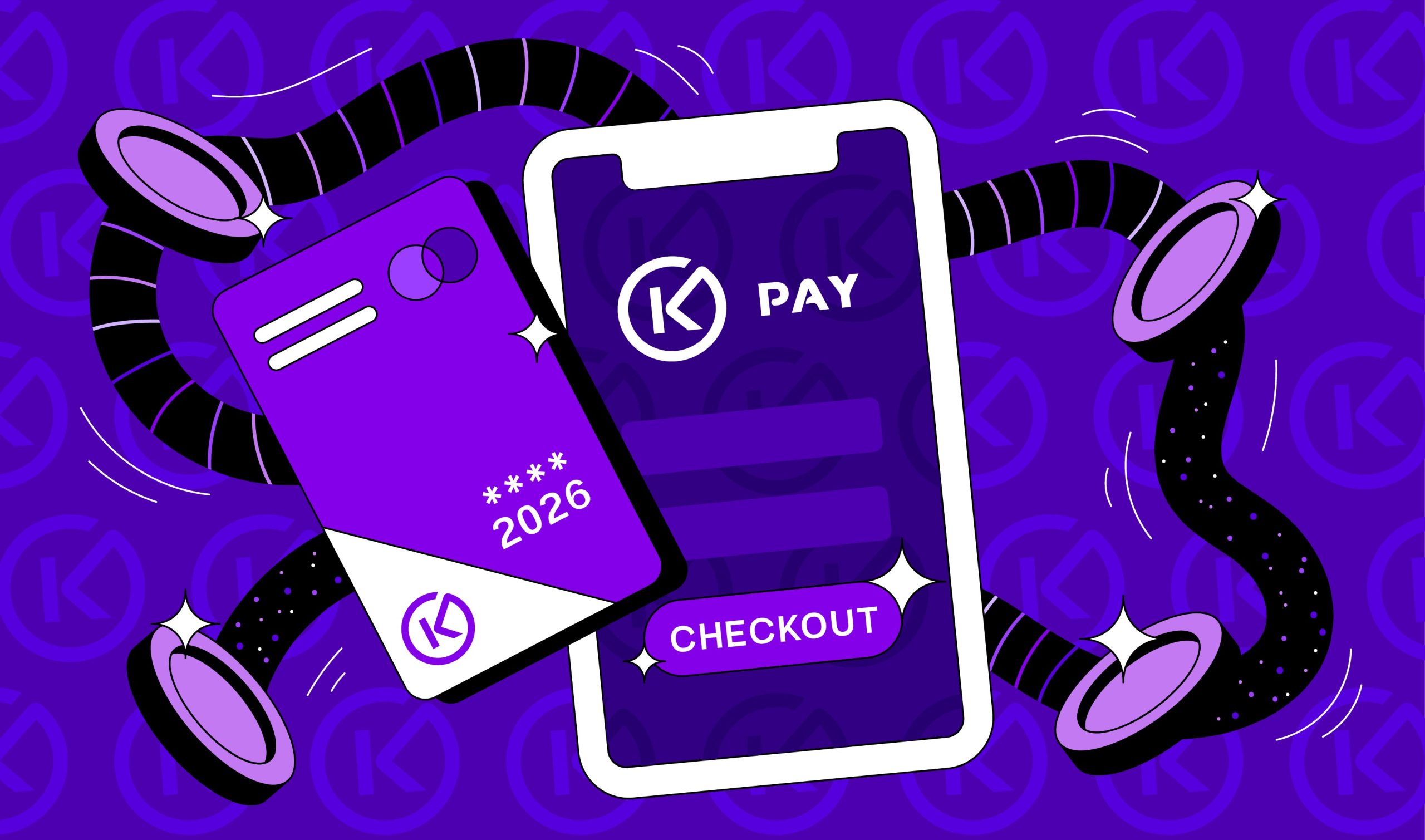
Using 12 years of data and information from 37,000 checkout tests, Krepling Pay developers created an experience that applies heatmap study-backed research and applies it in real-time to help prevent checkout page cart abandonment. Here is an overview of how Krepling Pay can help you solve the majority of abandoned carts.
If autofill is enabled, Krepling Pay dynamically hides unnecessary fields in the checkout process. Removing auto-filled fields reduces the user’s cognitive load and prevents the need to double-check every field.
In moments when users begin to hesitate, the system provides reassurance via a prompt that assures platform security. For example, it could say, “Your Payment is 100% Secure.”
Instead of guiding the user through a process, Krepling Pay anticipates their needs and addresses them without having users get stuck in the weeds.
Krepling Pay uses AI technology to improve user interactions with checkout pages even further in real-time. It automatically detects hesitation points and then adapts the UI to better suit the user’s needs.
For example, if a user pauses on the credit card field, a trust badge appears, helping ensure trust in the platform to the user. Additionally, if users hover over shipping areas too long, a tooltip will appear that gives a breakdown of the shipping price.
While in the payment section, if the back button is selected, the previously used payment method is selected on return. These features are designed to dynamically instill confidence and boost usability.
Research has shown that users decide whether they trust a site or not within five seconds of visiting the checkout page. Checkout heatmap studies showed that users scan the top left first, so Krepling’s system places guest checkout at the top left for better eye-tracking optimization, reducing rage click incidents while looking for checkout options.
Additionally trust badges and testimonials appear in a similar visual pathway to be less intrusive and clearly visible to hesitant shoppers. Of course, regardless of any changes made through AI hesitation detection, the pay button remains static to ensure trust remains high.
When these adjustments are made, you can expect a 32% increase in conversion rates on your checkout page. They also reduce hesitation time by 54%, while rage clicking is reduced by roughly 67%.
Kreppling Pay addresses UX issues associated with checkout page cart abandonment. The system is based on research findings from 200,000 data points and 12 years of data collection. Krepling was developed using heatmap and session tracking to identify key issues that other common UX methodologies didn’t address. Trust signal absence and decision anxiety are huge factors that aren’t discussed enough.
Heatmaps and session tracking proved traditional UX thinking to be outdated. Krepling Pay offers a way forward with AI-driven, behavior based checkout experiences that provide added trust when needed on top of a more streamlined checkout experience with less rage clicking.
For example, checkout pages adapt to real-time behavior. Personalized payment prioritization shows the payment method users are most likely to choose rather than inundating them with a selection of multiple previously used cards. Micro-interactions like trust prompts can nudge hesitant users.
Krepling Pay, however, offers a unique solution by offering a zero-friction layout with dynamic prioritization powered by AI. This system is designed to reduce hesitation and prevent rage-clicking, two factors highly associated with checkout page cart abandonment. Thanks to these reductions, the system is able to deliver a 32% increase in conversion rates. By enhancing user confidence and streamlining the checkout process, you can see incredible results with Krepling Pay.
Learn how Krepling Pay can power your business—whether you’re enhancing your existing checkout or launching a fully embedded, end-to-end retail experience.