Implementation guide
How to Create a Frictionless Checkout Experience: Step-by-Step Implementation Guide
Learn how to create a frictionless checkout experience that increases conversions by 31%. A step-by-step guide to reducing checkout fields, eliminating account barriers, and optimizing for mobile.
On this page
Every additional form field in your checkout costs you customers. Research shows that the average online checkout requires users to complete 12 to 15 fields across three separate pages. Each extra field, each additional step, and each unnecessary account-creation prompt adds friction that drives potential buyers away.
The solution is frictionless checkout: a streamlined, one-page experience that captures only essential information and removes every barrier between browsing and buying. This guide walks you through the exact steps to implement a frictionless checkout that can increase conversions by 31% while reducing transaction time by 44%.
Whether you manage checkout for a fashion brand, beauty retailer, or food and beverage shop, this framework will help you eliminate friction points and recover revenue lost to cart abandonment.
What is frictionless checkout?
Frictionless checkout is a payment experience optimized to minimize customer effort. It has three defining characteristics:
- One page — all information collected on a single screen with no multi-step progression
- Six essential fields — name, email, address, city, state, and payment information only
- Zero forced account creation — guests can complete purchases without registering
This contrasts sharply with traditional flows that require 12 to 15 fields spread across multiple pages, often forcing account creation before payment.
| Checkout type | Fields | Pages | Account required | Avg. completion time |
|---|---|---|---|---|
| Traditional checkout | 12–15 | 3 | Yes (often) | 2–3 minutes |
| Frictionless checkout | 6 | 1 | No | 45–60 seconds |
| Express buttons (PayPal, Apple Pay) | 0 visible | 1 (redirect) | Yes | 30–45 seconds |
| Platform guest checkout | 8–10 | 2 | Optional | 90–120 seconds |
The table reveals why frictionless checkout delivers superior conversion rates. It removes the cognitive load of multi-step navigation while avoiding the account-creation barrier that causes 19% of cart abandonment.
The friction problem: every extra field costs conversions
Checkout friction manifests in four costly ways:
Form length friction
Each additional form field increases the perceived effort required to complete a purchase. Studies show that reducing form fields from 11 to 4 can increase conversions by 120%.
Multi-step friction
Breaking checkout across multiple pages forces users to commit to progression without seeing the full picture. The Baymard Institute found that 18% of shoppers abandon carts because the checkout process is too long or complicated.
Account-creation friction
Requiring registration before purchase creates a psychological barrier. Users perceive account creation as committing to a long-term relationship when they simply want to complete a transaction. This single requirement accounts for 24% of all cart abandonment.
Mobile friction
When checkout forms aren’t optimized for mobile, users face tiny tap targets, difficult text entry, and endless scrolling. With mobile commerce representing 60% of e-commerce traffic, mobile friction translates directly to lost revenue.
The compounding effect is severe: a checkout with 15 fields, three pages, forced account creation, and poor mobile optimization can lose 70% or more of the potential buyers who reach the checkout page.
The 6-step implementation
Step 1: Audit your current checkout for friction points
Before implementing changes, document your existing checkout experience and identify specific friction sources. Map your current flow — create a visual representation of every page, field, and decision point. Note:
- Total number of fields
- Number of pages or steps
- Fields marked required vs. optional
- Account-creation requirements
- Mobile vs. desktop differences
Analyze form fields. Review each one and ask: Is this legally required to process payment? Does it directly reduce fraud or shipping errors? If neither, mark it for removal. Common unnecessary fields include company name, phone number, address line 2, separate billing address, marketing preferences, and account password.
Measure current performance. Establish baselines before changing anything: cart abandonment rate, checkout completion rate, average time to purchase, mobile vs. desktop conversion, and drop-off at each step.
Step 2: Reduce to the essential 6 fields only
The core of frictionless checkout is field reduction. Limit your checkout to six essential fields:
- Full name
- Email address
- Street address
- City
- State / province
- Payment information (card number, expiration, CVV)
Handle edge cases without adding fields. Auto-populate city and state from ZIP code; default country to your primary market; collect phone post-purchase; default billing to same as shipping. Implement intelligent defaults using IP geolocation, and for returning customers (identified by email) auto-fill name and address from previous orders — without requiring login.
Optimize field order to match how users think: email first (for confirmation), then full name, then address fields together, with payment information last. This lets users complete contact and shipping details before committing payment, reducing psychological friction.
Step 3: Eliminate forced account creation
Account creation is the single largest avoidable barrier in e-commerce checkout. Remove it while preserving customer data:
- Offer post-purchase account creation. After payment, present a one-click “Save this information for faster checkout next time?” — this converts 40–60% of customers into account holders without pre-purchase friction.
- Implement email-based recognition. When a returning customer enters their email, recognize them and auto-fill previous info without a password.
- Use express checkout without account requirements. Advanced solutions use tokenization for one-click purchasing without external accounts — only a secure token is stored, never the card data.
- Clarify guest-checkout visibility. Give “Continue as Guest” the same visual hierarchy as “Sign In” so account creation never looks required.
Step 4: Optimize for the mobile experience
With 60% of e-commerce traffic on mobile, optimization isn’t optional. Apply these mobile-specific enhancements:
- Use appropriate input types —
type="email",type="tel", andinputmode="numeric"trigger the right keyboard - Implement large tap targets — buttons and fields at minimum 44×44 px, with padding to prevent mis-taps
- Enable autofill via standard
autocompleteattributes - Design for vertical scrolling — a single column on mobile, never side-by-side fields
- Minimize typing — dropdowns for state selection and address autocomplete
Step 5: Implement a platform-agnostic solution
Platform-agnostic checkout solutions integrate with your existing stack without custom development. The advantages:
- Eliminate the development burden — pre-built checkouts connect to Shopify, WooCommerce, Magento, and custom builds via standardized APIs
- Maintain brand consistency — white-label solutions keep customers in your branded experience rather than redirecting to third-party pages
- Ensure cross-platform consistency — identical experiences regardless of the platform powering your site
- Preserve flexibility — the checkout moves with you if you change platforms; WooCommerce/Magento can go live in 1–2 days, custom integrations within two weeks
- Access flat-fee pricing — transparent, flat-rate fees make revenue forecasting predictable
Step 6: Test and measure conversion impact
Implementation must be followed by rigorous measurement. Track: conversion rate (pre vs. post), checkout completion time (target a 40–50% reduction), device-specific performance (mobile should improve most), field abandonment (which fields cause drop-off), and revenue per visitor. Where possible, run an A/B test — 50% of traffic to the new flow, 50% to the old — for statistical validation.
Krepling’s approach: 44% faster than multi-step checkout
Krepling Pay’s checkout architecture demonstrates the frictionless approach in action, reducing the traditional multi-step, multi-field checkout to a single page with six essential fields. The performance difference is measurable:
Krepling Pay vs. traditional checkout
Unlike express buttons (PayPal, Apple Pay, Google Pay) that require external accounts and redirect users away, Krepling’s express option is built directly into the branded checkout. Using tokenization, every transaction creates a secure token that can be saved for one-click future purchases — without storing actual card information. The technical implementation requires no custom development: merchants receive white-glove support, with integration typically completed within 1–2 days for WooCommerce or Magento, or about two weeks for custom builds.
Technical implementation considerations
- PCI compliance — use certified processors that handle card data; leading solutions maintain PCI DSS and SOC 2 compliance
- Address verification — implement AVS to reduce fraud without adding visible fields
- Fraud detection — machine-learning detection that works invisibly, not CAPTCHA challenges
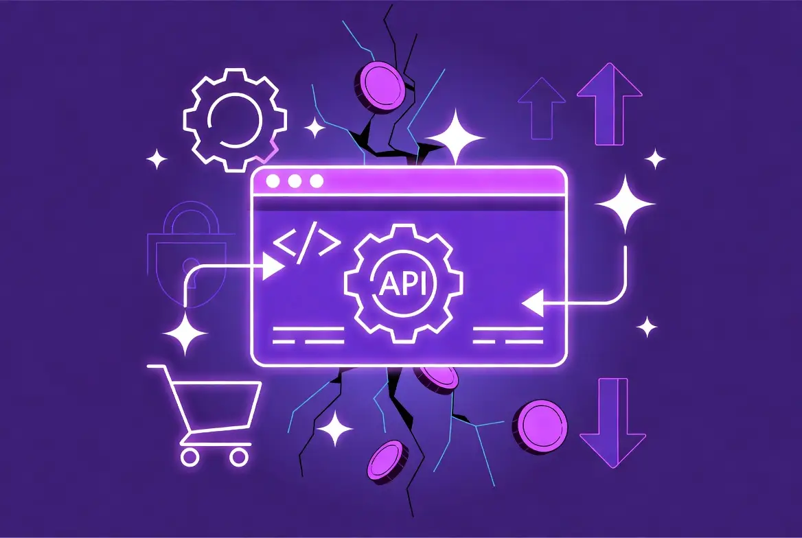
- API integration — RESTful APIs with thorough documentation for order, inventory, and CRM systems
- Payment-method flexibility — cards and digital wallets through one unified interface
- Localization — multiple currencies, languages, and address formats without adding fields for domestic buyers
Results to expect: 31% higher conversion rates
Businesses implementing frictionless checkout typically see measurable improvements within 30 to 60 days:
- Conversion rate increase — typically 25% to 35%, with mobile showing larger gains than desktop
- Revenue lift — a site with $1M annual revenue and a 30% conversion improvement generates an extra $300,000 with no added marketing spend
- Cart-abandonment reduction — from the industry average of ~69.8% to below 50%
- Customer satisfaction — streamlined checkouts rate more positively and increase repeat purchases
- Competitive advantage — a meaningful differentiator where competitors keep multi-step checkouts
Results vary by starting point. Businesses with particularly high-friction checkouts (15+ fields, forced accounts, poor mobile optimization) will see larger improvements than those starting from better baselines.
Actionable implementation checklist
- Audit current checkout: document all fields, pages, and requirements
- Establish baseline metrics: conversion rate, completion time, abandonment rate
- Remove non-essential fields: reduce to six core fields
- Eliminate forced account creation: implement a post-purchase account option
- Optimize for mobile: input types, large tap targets, single-column layout
- Implement address autocomplete: reduce typing on mobile devices
- Select a platform-agnostic solution compatible with your platform
- Integrate payment processing: ensure PCI compliance and fraud detection
- Test on multiple devices: iOS, Android, desktop browsers
- Set up analytics: monitor field abandonment and completion metrics
- Run an A/B test against your existing flow
- Measure results: conversion rate, revenue per visitor, completion time
- Iterate based on data: refine fields and flow from real user behavior
Conclusion
Checkout friction is costing your business real revenue. Every unnecessary field, each additional page, and all forced account-creation prompts drive potential customers away. Implementing frictionless checkout with one page, six essential fields, and zero account requirements can increase your conversion rate by 31% while reducing transaction time by 44% — improvements that translate directly to recovered revenue without increased traffic or marketing spend.
The technical implementation is simpler than building custom checkout flows. Platform-agnostic solutions integrate with your existing stack without custom development, maintaining brand consistency while delivering measurable performance gains. Your next step is to audit your current checkout, identify specific friction points, and implement a streamlined solution that removes the barriers between browsing and buying.